A logo design or brand concept is the crucial foundation stone in establishing a company's identity. Get this right and utilise it in a consistent fashion and you will have the basis of an effective brand design.
Our logo design service is at a fixed price, regardless of time spent on the job - no hidden extras. You receive a digital master set of your logo in a number of formats for any future application. We can also establish brand guidelines for your logo usage.
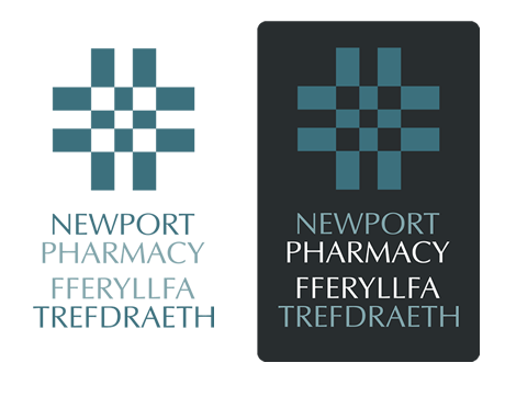
Newport Pharmacy
This logo for an independent pharmacy based in Pembrokeshire utilises a pattern derived from the traditional Welsh 'Carthen' blanket patterns. It conveniently lends itself well to the medical side of the brief given.
The colours used were dictated by the rigorous planning laws in the seaside town which would not allow anything garish or overly prominent.
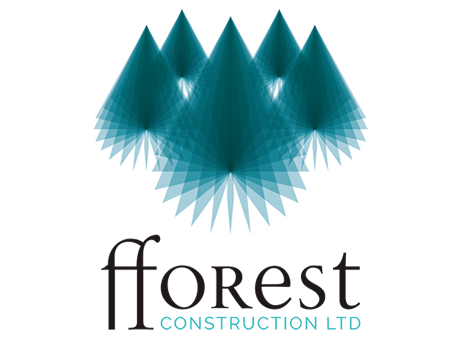
Fforest Construction
We had a very open brief for this Swansea based building company, the client expressing that they wanted something fresh in the field. We developed this dual purpose tree shape built of individual rotated triangles to satisfy both elements of the company's name.
The logo was used on stationery, website and scaffolding banners and will soon feature on the company's vehicles.
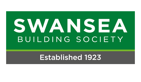
Swansea Building Society
This redesign of Swansea Building Society's brand stayed close to the existing logo, replacing the font used, consolidating the colour across the brand and defining guidelines for usage to help keep high standards of consistency across all publications.
The logo is the mainstay of a corporate re-brand which covers company stationery, annual reports, product leaflets and all manner of forms and information documentation. The Brand guidelines we developed can be viewed here.
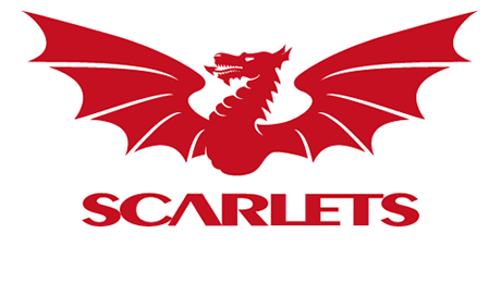
Scarlets
The keystone of the branding of the Rugby Region for West and North Wales, this logo design was developed from a traditional crest design and given a simpler, more contemporary look.
It has appeared on all manner of merchandising, the team shirt and accessories and a wide range of publications, including the matchday rugby programme and quarterly magazine. It has also been made into a huge stadium sign at the region's headquarters, Parc y Scarlets.
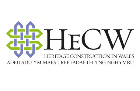
Heritage Construction
This logo design for Heritage Construction in Wales was based on a Carthen Style Celtic Weave pattern. It is supported by a well designed traditional style font that brings solidity and reassurance to the brand.
The logo was supplied in two versions, with and without the lengthy bilingual strapline. These were supplied in our standard range of file formats and colour models for use in all future requirements from digital display to signage or print work.
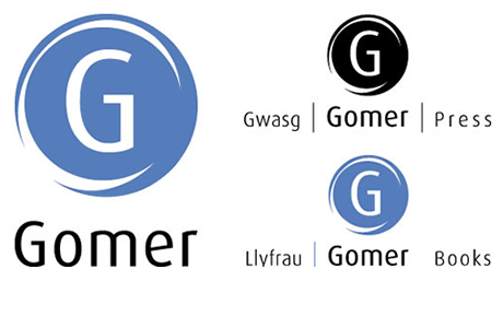
Gomer Press
A bilingual logo design for a Welsh national book publisher and print company. Simplicity of design and flexibility of use were paramount in the brief.
The logo is used in numerous ways, from black-and-white frontispiece to gold blocking on the cover spines of books, as well as the company stationery, brochure design and advertising.
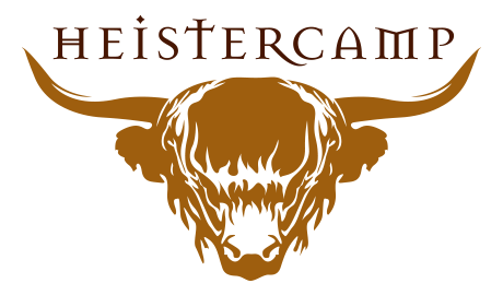
Heistercamp
Heistercamp make high quality handmade leather belts and guitar straps from their workshops in North Devon. They wanted a modern yet traditional approach to their logo design with the one proviso that it had to be simple enough to be developed into an actual brand, i.e. a stamp that would be pressed into their products.
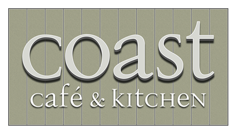
Coast
Coast is a new bistro and deli in the pretty seaside town of Aberdovey in Wales. The café is shabby chic in its styling and the logo reflects that using a tongue and groove board effect for the background with raised letters on top. It is used in signage and menus as well as their website.
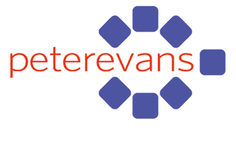
Peterevans
The foundation stone of a major corporate re-branding exercise for a modular financial software consultancy.
The logo design is a key element, both in its own right and as a graphic icon on business stationery, newsletter design, packaging and exhibition stand. We have recently redesigned the company's website.
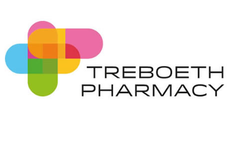
Treboeth Pharmacy
This logo design for a well established local business was initiated by the new owner's desire to modernise the business identity in conjunction with a shop refit.
The project will develop through stationery design, bags, shop signage and vehicle livery design. This will build into an eye-catching brand with significant presence.
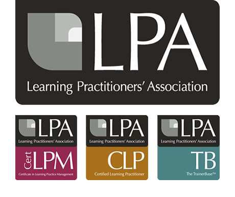
LPA
The Learning Practitioners' Association wanted a brand design that encompased both their main corporate logo and three 'product' logos that could work in harmony with each other.
We also developed a brand guideline document for them which can be viewed here. (PDF 1.6MB).
The LPA icon was designed from distilling a stylised version of the L, P and A and became the foundation of a striking but sober logo. We have already utilised the logo and brand guidelines in A4 flyers, advertisement, banner stand designs and a course prospectus design for one of their professional qualification awards.
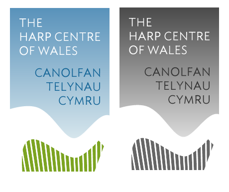
Harp Centre of Wales
The Harp Centre of Wales were in need of an iconic re-brand as part of their repositioning in the Harp manufacturing and supply business.
The company is firmly based in the heart of the Welsh countryside and it was this that proved to be the inspiration behind the logo with a parallel being drawn between the sinuous lines of a harp and the rolling hillsides with a sky blue gradient added a constraining space to the text.
We also provided flyers and an advertising campaign.
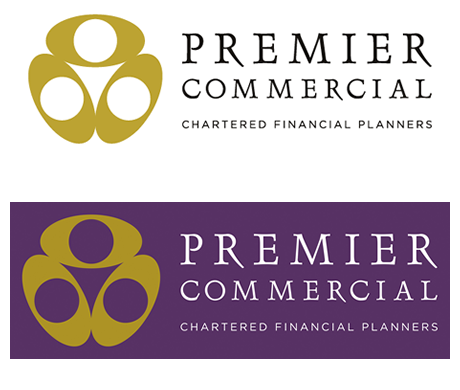
Premier Commercial
This brand design for a high end financial advice company is based on a bird's eye view of the three founding partners in conference.
Marrying a sharp, modern vector-drawn icon with a traditional serif font suggests reliability with an eye to the future. We supplied stationery, brochure, folder and website design for the company.
As with many of the logos we design we also provided a reversed-out version for use against a coloured (in this case purple) background or dark image.
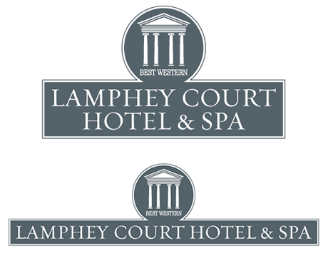
Lamphey Court Hotel
This logo design for a Pembrokeshire Hotel and Spa was inspired by the building's impressive Palladian portico.
The font chosen and the colour convey gravitas and solidity in a stylish manner. It was produced in both wide and narrow versions.
We also produced a separate but related logo for the Spa which is less formal but retains colour and font links with the master logo. A brand guidelines document was also provided - click here.
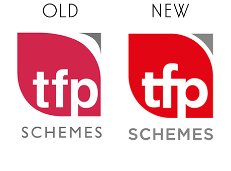
TFP Schemes
We are often required to refresh an existing logo, sometimes this means a complete reworking of a poor historical original. On other occasions it is simply a case of re-defining parameters, adjusting shapes and consolidating colour schemes and fonts as the foundation for a corporate brand design.
In the case of TFP Schemes' logo we redrew the established 'leaf' shape to be symmetrical, chose a fresher font and combined the initial letters into a neater arrangement. The colours were also standardised as can be seen in their brand guidelines document.
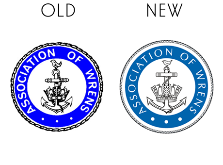
Association of WRENS
Another example of our redrawing or rejuvenation of an old established logo of which a company or organisation no longer have a useable copy.
The Association of Wrens required us to design a brochure commemorating their 90th anniversary but were unable to provide a good quality version of their long used logo.
We were able to scan in the old version and completely redraw it digitally. We then provided them with a master set of logos in multiple formats for all eventualities.
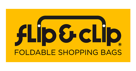
Flip & Clip
Logo design for a new company which will be selling reuseable "bags for life" made of 100% recycled material. The bags will retail in discount stores and shopping centres.
The design features an unusual display font (Variex) with modified, joined 'i" bars to form a bag handle. The white dots of the 'i' reflect the signature white pop fastners which are an integral part of the bag.
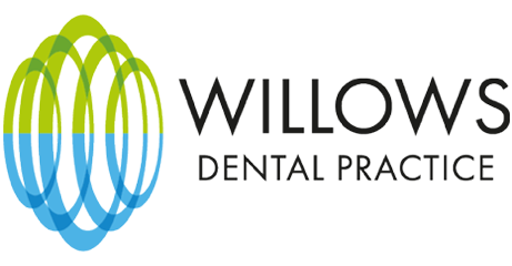
Willows Dental
A rebrand for a well established dental practice who are moving to a larger premises.
The logo is built of a stylised weeping willow shape reflecting in water. The rebrand will include an internal and external signage scheme, stationery, leaflet designs, advertising and website.
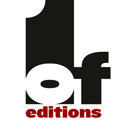
ONE OF EDITIONS
A logo design for an online photo gallery providing limited edition prints to the art-buying public.
The logo is a classic typograph of a minimalist nature based simply on the text of the name. Oneofeditions' website has been established in order to promote the collection of limited edition photographs and to provide access to the works of a variety of photographers, focusing exclusively on contemporary practice.
The Spinal Health Clinic
A corporate logo design for a chiropractic franchise operator.
The logo was developed around a 3D construction of a flower, with the stem built to look like a spine. It has been used in business stationery, signage, advertising design, brochure design and flyer designs.